
Maximalist Interior Design: Bold Colors & Patterns Guide
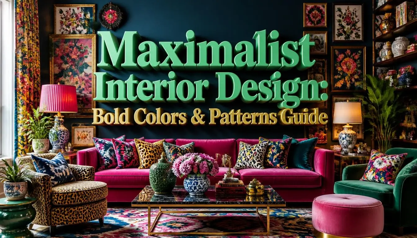
Maximalist interior design is the practice of filling a room with layered color, mixed patterns, rich texture, and personal objects on purpose. It is not the same as clutter. Every piece earns its spot. The working formula is 3 to 5 repeating colors, three pattern scales that share one hue, four types of texture, and five light sources. When these elements work together, the room feels bold and interesting, not busy.
Worried bold patterns will clash once painted? 3D interior rendering services let you preview the finished room before spending on any wallpaper or paint.
What Is Maximalist Interior Design?
Maximalist interior design is a decorating approach built on abundance and personality instead of restraint. Walls get color. Floors get patterns. Shelves get filled. Art goes edge to edge.
The core idea is simple: your home should look like someone specific lives there.
Minimalism strips a room down until nothing distracts. Maximalism does the opposite. It adds until the room tells a story and then stops. That stopping point is the part most people miss.
This is not new. Victorian parlors were packed with taxidermy, patterned wallpaper, heavy drapes, and display cabinets. The 1980s brought it back through designers like Mario Buatta, whose chintz-heavy rooms earned him the nickname “The Prince of Chintz.” Iris Apfel carried the same idea into fashion and interiors for decades.
What changed in the 2020s is the reason people do it. It used to signal wealth. Now it signals identity.
What Makes a Room Maximalist and Not Just “Decorated”?
Four signals show up in almost every true maximalist room:
- Color coverage above 70%. Walls, ceilings, or trim carry saturated color, not just cushions.
- Three or more patterns visible at once from a single standing position.
- Collections displayed, not stored. Books, ceramics, frames, plants.
- No blank feature wall. The eye always has somewhere to go.
Miss two of those and you have an eclectic room. That is fine; it just is not maximalism.
Is Maximalism Just Clutter With a Nicer Name?
No. Clutter is unmade decisions. Maximalism is many decisions made at once.
The difference is measurable. A cluttered room has objects with no assigned home. A maximalist room has objects in deliberate groups, at deliberate heights, in a deliberate color story.
This distinction matters more. A 2010 study by Darby Saxbe and Rena Repetti at UCLA, published in Personality and Social Psychology Bulletin, analyzed video home tours from 60 dual-income spouses. Wives who used more clutter-related and “unfinished project” language showed flatter daily cortisol slopes, a stress pattern linked to poor health outcomes.
Read that carefully. The study measured how people described their homes, not how much stuff was in them. The stress signal came from mess and unfinished work. Not from abundance.
That is the whole point. Full is fine. Unfinished is not.
The Clutter Test to Use on Every Room
Stand in the doorway. Look for 10 seconds. Then answer three questions:
- Can you name why each visible object is there? If more than three items get “I don’t know,” you have clutter.
- Does anything have no home? Mail piles, chargers, laundry. Those are clutter regardless of style.
- Is anything unfinished? Half-hung shelf, unpatched wall, a rug still curling at the corners.
| Curated maximalism | Actual clutter |
| Objects grouped in threes and fives | Objects scattered singly |
| Repeating color across the room | Random unrelated colors |
| Every surface has a purpose | Surfaces are drop zones |
| Collections displayed at set heights | Items stacked wherever they landed |
| Room feels finished | Room feels paused mid-project |
How Do You Choose Colors for a Maximalist Interior Design?
Pick 3 to 5 colors, then repeat every single one at least three times in the room. That repetition is what separates rich from random.
Here is the structure that works:
- 1 dominant color: walls or a large piece of furniture. Roughly 50–60% of what you see.
- 2 supporting colors: upholstery, curtains, and rug. Roughly 30%.
- 1–2 accent colors: art, ceramics, trim, lampshades. Roughly 10%.
The rule that matters: no color appears only once. If your wallpaper has burnt orange, something else in the room needs burnt orange. A cushion trim. A book spine on display. A candle.
Paint samples also lie. A chip that looks warm in the shop turns cold under a north-facing window. Many homeowners now test palettes digitally before committing, and residential rendering services can show the same room in three full color schemes before a single wall is touched.
Which Colors Actually Work in Maximalist Style Rooms?
| Color family | Best used as | Pairs well with |
| Emerald/forest green | Dominant (walls, sofa) | Brass, coral, blush, chocolate |
| Deep navy/ink blue | Dominant | Mustard, rust, ivory, gold |
| Chocolate brown | Dominant or grounding | Cream, sage, terracotta, pink |
| Oxblood/burgundy | Supporting | Emerald, warm white, gold |
| Terracotta/rust | Supporting | Teal, olive, cream |
| Mustard/ochre | Accent only | Navy, plum, charcoal |
| Hot pink/coral | Accent only | Green, chocolate, navy |
Notice the accent-only row. Those colors are wonderful in small doses and exhausting on four walls.
Does Bold Color Hurt Your Home’s Resale Value?
Not the way people assume, and 2026 data flips the old advice. Zillow’s 2026 Paint Color Analysis surveyed thousands of US buyers on how interior paint colors affected their interest, tour likelihood, and offer price.
The findings:
| Color and room | Effect vs. white walls |
| Chocolate brown bedroom | +$2,277 (highest of any interior color) |
| Pale blue living room | +$1,723 |
| Charcoal gray living room | +$1,509 |
| Charcoal gray kitchen | +$1,373 |
| Charcoal gray bedroom | +$1,240 |
| Sage green bedroom | +$1,035 |
| Dark plum kitchen | +$867 |
| Fire-hydrant red bathroom | −$7,971 |
| Blush pink bathroom | −$6,013 |
Sage green was the only shade to rank top-tier in every room studied. Ochre yellow was the worst performer overall.
The takeaway is not “avoid color.” It is the opposite. Buyers paid more for deep, grounded, saturated rooms than for white ones. What they punished was high-chroma novelty color in wet rooms: fire-hydrant red and blush pink bathrooms.
So go dark and rich on the walls. Save the shocking hues for objects you can carry out the door.
How Do You Mix Bold Patterns Without It Looking Like a Mess?
Use three different pattern scales that share at least one color. That single rule solves 90% of pattern problems.
The three-scale system:
- Large scale: one big pattern. Wallpaper, a bold rug, or a patterned sofa. One per room.
- Medium scale: two or three. Curtains, an armchair, a large cushion.
- Small scale: three or more. Throw pillows, ceramics, lampshades, and a footstool.
If two patterns are the same size, they fight. If they are different sizes, the eye reads them as layers instead of competition.
Which Pattern Combinations Actually Work?
These pairings are reliable:
- Floral + stripe: the safest mix in existence. The stripe calms the florals.
- Geometric + organic floral: hard lines against soft curves.
- Animal print as a neutral: leopard reads like a texture, not a pattern. Use it the way you’d use beige.
- Large botanical + small check: classic English country maximalism.
- Paisley + solid velvet: velvet gives the eye a rest without going flat.
Two combinations to avoid: two florals at the same scale, and two geometrics with the same line weight. Both read as a printing error.
How Many Patterns Is Too Many?
Five to seven patterns per room is the working range for most people. Beyond that, most viewers stop processing the room and start avoiding it.
But “most people” are doing heavy lifting there, and the research explains why. A study by Güçlütürk and colleagues published in Frontiers in Human Neuroscience in 2016 tested how 30 participants rated images for both liking and perceived complexity. Design has long assumed an “inverted-U curve,” meaning everyone prefers a moderate amount of visual complexity.
The study found that the curve is an illusion created by averaging. When researchers clustered participants individually, one group liked images more as complexity increased. Another group liked them less. The famous middle-preference curve was just two opposite groups mashed together.
This is the strongest argument for maximalism that exists. Complexity preference is genuinely individual. If busy rooms make you feel alive, that is not bad taste. It is a documented preference profile. Design for your own eye, not the average one.
Practical version: if you love the seven patterns, keep going. If you feel tense at four, stop at three. Both are correct.
Which Rooms Suit Maximalist Aesthetic Best?
Start with rooms people pass through or gather in. Save the ones tied to sleep and hygiene for later.
| Room | Difficulty | Best first move |
| Powder room / small bathroom | Easiest | Full-coverage wallpaper; it’s tiny, so cost is low and impact is huge |
| Entry/hallway | Easy | Deep paint plus a dense gallery wall |
| Dining room | Easy | Dark walls, patterned chairs, statement light |
| Living room | Medium | One large-scale pattern, then layer around it |
| Bedroom | Medium | Color-drench the walls, add a patterned headboard |
| Kitchen | Harder | Painted cabinets in a deep shade, patterned splashback |
| Full bathroom | Hardest | Tile and fixtures are expensive to reverse; go bold with textiles and paint only |
The powder room is the standard starting point for a reason. It is the cheapest room to wallpaper; nobody spends an hour in there, and it is where a bold choice is most fun.
What Mistakes Ruin Maximalist Rooms?
Seven mistakes show up over and over and ruin maximalist home decor:
- Bold wallpaper on one wall, plain white on the other three. The wallpaper looks stranded. Fix: paint the remaining walls a color pulled directly from the wallpaper.
- Too many colors, none repeated. Twelve colors used once each read as noise. Fix: cut to five and repeat every three times.
- All patterns at the same scale. Fix: force one large, two medium, three small.
- Zero negative space. The eye needs a landing spot. Fix: leave one solid surface, a plain wall section or an empty tabletop corner, deliberately bare.
- One overhead light. Fix: add four more sources at different heights.
- Everything bought new in one order. Fix: replace at least three items with vintage, inherited, or travel finds.
- Nothing personal in the room. This is the fatal one. A maximalist room full of trend purchases is just an expensive mood board. Fix: at least a third of the visible objects should have a story you can tell out loud.
Final Word
Maximalist interior design rewards people who know what they like and are willing to be obvious about it. The rule is to keep a room readable, not safe. Pick your five colors. Repeat them. Vary your pattern scales. Light it warm and light it five ways. Buy paint before furniture. It is the cheapest thing to redo and the fastest thing to change a room. Then fill the room with things that mean something to you and stop when the story is told. Buy paint before furniture. Paint is the cheapest thing to redo and the fastest thing to change a room. A room that looks like nobody else’s is the whole point.
Frequently Asked Questions
Q1: What is the difference between maximalism and eclectic style?
Eclectic means mixing eras and origins. Maximalism means quantity and saturation. An eclectic room can be sparse: three objects from three centuries on a bare wall. A maximalist room is full by definition. Most rooms labeled maximalist are also eclectic, but the two are separate ideas. Eclectic is about variety; maximalism is about density.
Q2: How do I start maximalism if I own only neutral furniture?
Keep the furniture and change everything around it. Paint the walls a deep color, add a large patterned rug, hang curtains with a bold print, and pile on patterned cushions. Neutral sofas are actually an advantage because they act as a rest point between busier layers. Spend on paint, textiles, art, and lighting first.
Q3: How do I stop a maximalist room from feeling stressful?
Add negative space and warm light. Leave one solid wall section and one clear tabletop deliberately empty so the eye has somewhere to rest. Then check your bulbs. Anything above 2700K makes saturated rooms feel harsh. If it still feels tense after 20 minutes of sitting, remove the three smallest objects and reassess.